Tips for LED Video Wall Content Creation

Creating content for a video wall is different than for other media outlets. It’s an art form unto itself with its own set of methodologies. There are design principles the creator must adhere to for the content to be successful. Because it’s so large, the video wall demands attention, and people will look at it, but it’s a wasted opportunity if the content isn’t on point. Put some of these tips for LED video wall content creation into practice and see the difference.
Get the Aspect Ratio Right
The most important thing to remember in video wall content creation is the aspect ratio. Design your content with the ratio at the forefront of your mind, and don’t stray from it. Creating outside the ratio will lead to distorted images that don’t look right. If the wall is 960 x 540, then you can display files at 960x540p. Scaling up the file resolution to be higher than the LED board will not increase the image quality.
Know the Viewing Distance
The pixel density of the LED panel and the viewing distance will determine how big and bold you should make the graphics. Generally speaking, the lower the screen resolution and further the viewing distance, the bigger you should make the graphics. Larger outdoor video walls, such as those at a stadium, should have larger graphics that are easy to see at great distances. With high resolution indoor LED displays, you can get away with using smaller graphics because the viewing distance will be shorter in most cases.
Use Motion Graphics To Captivate The Viewers
Did you ever see something out of the corner of your eye and immediately turn your head? That principle applies to LED video wall content. You should use motion graphics instead of static ones when possible. A moving image will get more attention than a static one every time, and that’s the goal—getting attention.
Use The Full Color Spectrum In Your Content Design
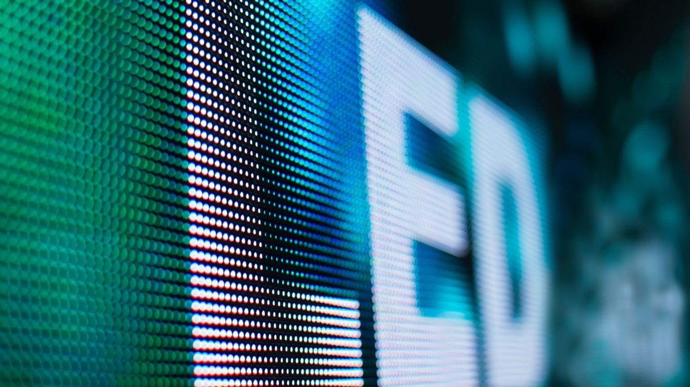
Direct view LED screens has excellent contrast ratio performance, vibrant color performance, and brightness levels. Feel free to use high contrast in your content to avoid washing out your images or video. Contrasting colors make thing easier to see by making the foreground and background discernable at a distance. The contrast doesn’t have to be as stark as white on black, but you’ll want to use navy blue instead of light blue and yellow instead of purple. Basic rules of graphic design will apply here.
For even more assistance on your LED video wall content, contact one of our team members, and we will be happy to help!


